
Thursday, April 30, 2009


Ideas for Postcard


Shirley Bassey came to mind when I read this phrase because of that song 'history repeating'. Then I started looking at some of her other songs, like 'Goldfinger' and thought of all the 007 movies, and how they've changed over the years. This could be my theme for my postcard.
“Isn't life a series of images that change as they repeat themselves?” ANDY WARHOL


Time to brainstorm.
Key words of the phrase:
Life: human, heart, breathe, everyday life, wildlife, life support,
Series: tv series, collection,
Change: sea change, change of clothes, change of heart, swap, different,
Repeat: repetition, stamp, again,
Dada Photo-collage Artists: John Heartfield,Aleksandr Rodchenko, Hannah Hoch
Pop artists:Andy Warhol, Richard Hamilton and Robert Raushenberg.
Thursday, April 23, 2009


Wednesday, April 22, 2009


Friday, April 17, 2009
More chess history and exploration
Back to the Chess history and exploration...
I've finished my chess pieces- yet- I'm not totally happy with them. So, back to square one I go. Maybe I'll spark some ideas to improve some of the pieces. I think I'm going to look at what each piece symbolises- and how I could make that idea iconic.
Tuesday, April 14, 2009
Poster idea

http://vi.sualize.us/view/1de94c7e15cf7cde88317515272efa23/
This image sparked an idea in my head for my poster. Seeing these forms and the way they interact with each other through shape and colour has made me think about the chess pieces I've created, and ways that I can arrange them on my poster. I'm considering not using 3D form at all, and just the sillhouette of my chess piece designs and combining them some how- maybe with typograpgy seeing as it's my theme?
Friday, April 10, 2009
More text use for poster design concept

http://zoefolio.blogspot.com/2008/06/dont-tell-mum-i-work-on-rigs.html
Karina Christin

http://karina-christin.com/index2.php
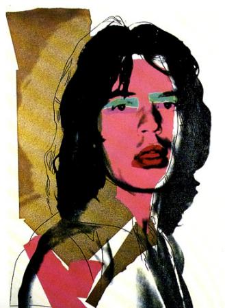
I came across this designer whilst trying to find some inspiration for an assignment. I really dig her use of positive and negative space- and her minimal use of colour especially in the 2nd illustration, where the colour scheme is red, black and a beige/white colour. (I can't attach this image unfortunately).
This was a seperate illustration I found on another site. Which I adore as well. The movement in the hair is so compelling.
I may use the idea of this "touch of colour" idea for my chess poster.

Thursday, April 9, 2009
idea for poster layout

Came across this image whilst brainstorming.
I like the layout- maybe use this idea of overlapping, and scale?


Thursday, April 2, 2009
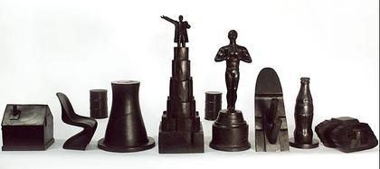
Chess Poster inspiration

This chess set from the Renault F1 Team Collection is made from parts of F1 cars. Interesting concept. I might look into this kind of idea for my chess piece design.
Subscribe to:
Comments (Atom)